Drawing For Tattoo Design: Choosing a Tattoo Color Palette 3 Minutes to Better Tattooing
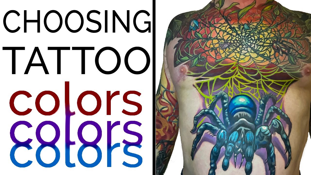
Choosing a Tattoo Color Palette | 3 Minutes to Better Tattooing
By Jake Meeks —
Topics: Tattoo Techniques, Color Theory, 3 Minutes to Better Tattooing, large scale tattoo, Tattoo Color Palette, analogous Color Palette,
This episode was made possible thanks to:
“The client decides he wants to do it massive and use the bulk of his stomach for the tarantula. So that really changes its relationship with the existing tattoo.”
– Jake Meeks
The Dilemma
Today on 3 Minutes to Better Tattooing, we're focusing on the significance of having a basic understanding of color theory.
Something to consider when going back into existing pieces is to step back for a minute or two to really see what’s working and what you could really expand on. Maybe there’s a section you really think is working well, but maybe you see a problem that’ll need to be tackled at a new angle because of what your client wants to add to the design.
We’ll be touching on how you can prepare yourself for future decisions, and more specifically, we'll be discussing complementary and analogous colors and how you can use these two palettes for different purposes. So let's get started!
The Piece We're Working With
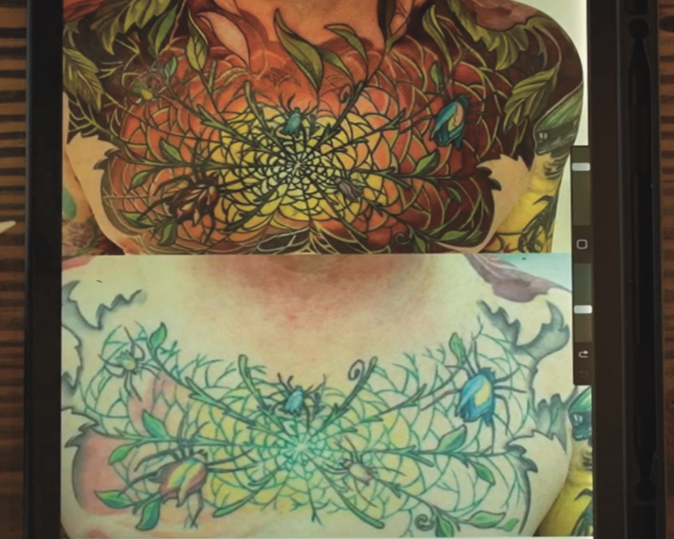
Chris wanted me to finish up this chest piece, which is 12 to 15 years old. You can see the before and after of it above. I wasn’t too crazy about the hybrid flower spiders so I used the existing yellows to make a focal point in the center and connected it to the rest of his collection back in March of 2020.
The Direction It Headed
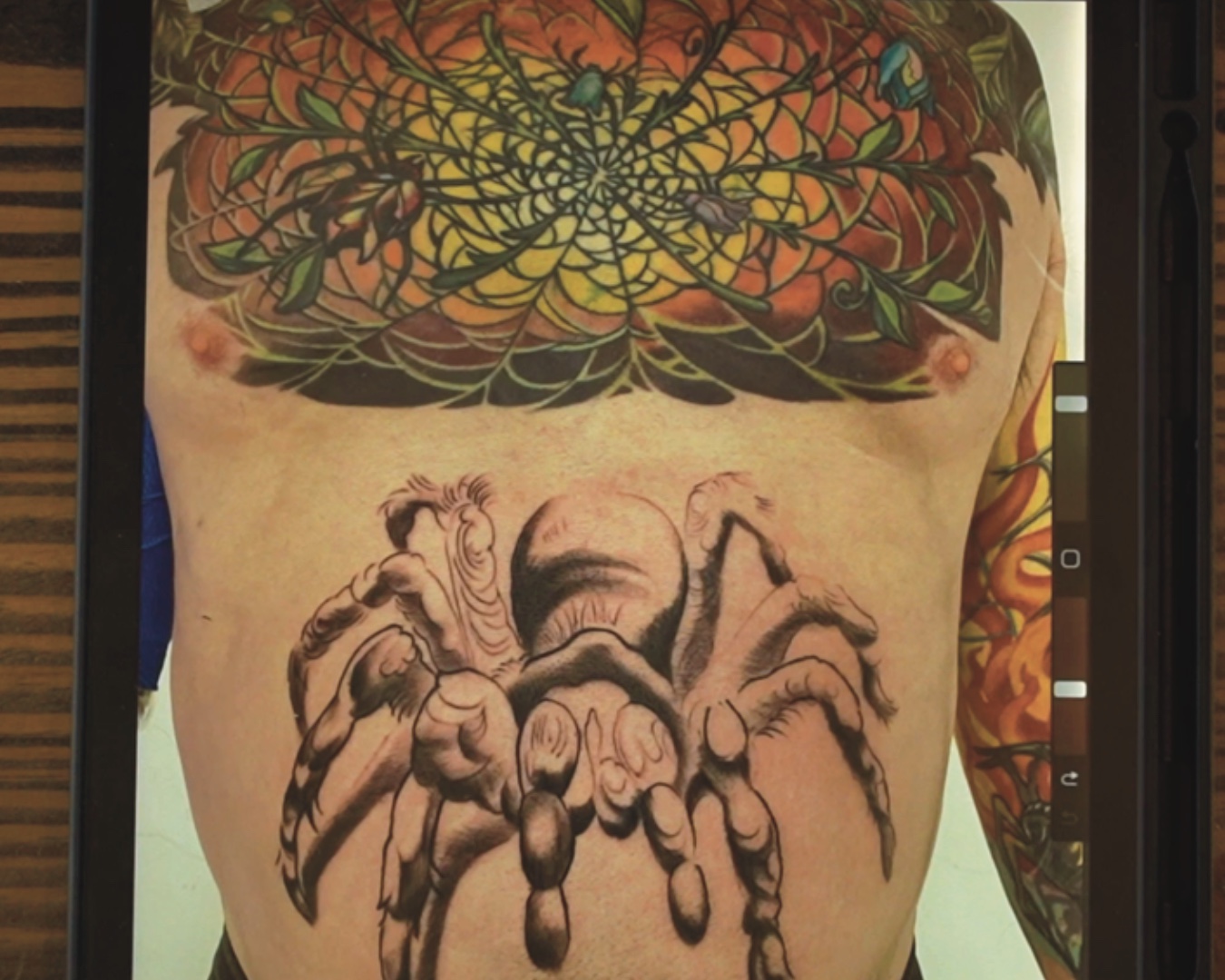
Then, my client began talking about how he wanted the piece to extend down his stomach so it wouldn't feel flat on the bottom of the spider web pattern. We decided to go with a blue tarantula that was around 2-3 inches large and I had planned out how to shape the piece accordingly.
However, come time for the appointment, my client had changed his mind and wanted something much bigger; almost taking up all of his stomach. With this new problem to solve, I had to find a way for the two pieces to merge together.
How I Solved It
“But instead of going back into the orange… I decided to switch to an analogous color palette to the blue tarantula.”
– Jake Meeks
To make the colors appear more balanced, I chose an analogous color palette for the spider and background. The spider's purple hue makes it less imposing compared to the darker tones in the upper background, which gradually soften towards the bottom and start to lighten up. By doing this, the large size of the spider doesn't overwhelm the focal point of the original piece.
“…I felt like adding the orange background and using the complimentary palette would’ve been overkill…”
– Jake Meeks
You can see that a small understanding of color theory can take your work a long way. In this example, I used complementary and analogous colors to balance the two pieces and create one overall cohesive tattoo that didn’t overwhelm any other part.
Want more tattoo education and resources?
Check out our Drawing for Tattoos catalog HERE!
Transcript can be found here. All Transcripts can be found here
The Fireside Tattoo Network is home to the Fireside podcast, Fireside Technique video series and our Fireside Weekly blog.
The Fireside Tattoo podcast is hosted by veteran tattooer Jake Meeks, check out our episodes where we discuss, argue and wax philosophical, from tips for all levels of artists to trends in the tattoo world. Many guest artists have sat down for interviews and in-depth conversations and many more are planned…check back often!
Our Fireside Technique video series offers short, detailed how-to videos geared towards helping artists improve their work. We often take some of our more technical topics from our Fireside podcast and film an in-depth, narrated, time-lapse video showing exactly how Jake or our featured artists handle certain issues.
Support us while buying the stuff you need at the links below!
- Get 10% off the Neuma 4 with code “Fireside” at checkout
https://neumatattoo.com - Get 10 % off all S8 Tattoo products with promo code “Fireside”
https://s8tattoo.com/ - TattooNOW Website and Automation services at the link below
https://TattooNOW.com/Fireside - Get 10% off your order from Raw Pigments with code “fireside”
https://rawpigments.co/
Drawing for Tattoo Design
Your tattoo designs starting to feel stagnant? Feel like you’re not progressing? Drawing is the single most important piece of the tattoo process. No level of technical tattoo skill can overcome bad composition and draftsmanship.
Fireside Tattoo Network simplifies the tattoo design process with the Fireside Method. By focusing on the principles of Shape, Value, Edge and Color, we help you identify and solve your biggest challenges early in the design process.
The Fireside Method:
Check out some of our podcast episodes as well!
Recent News
Tattooing Hands and Knuckles
- 04/10/24