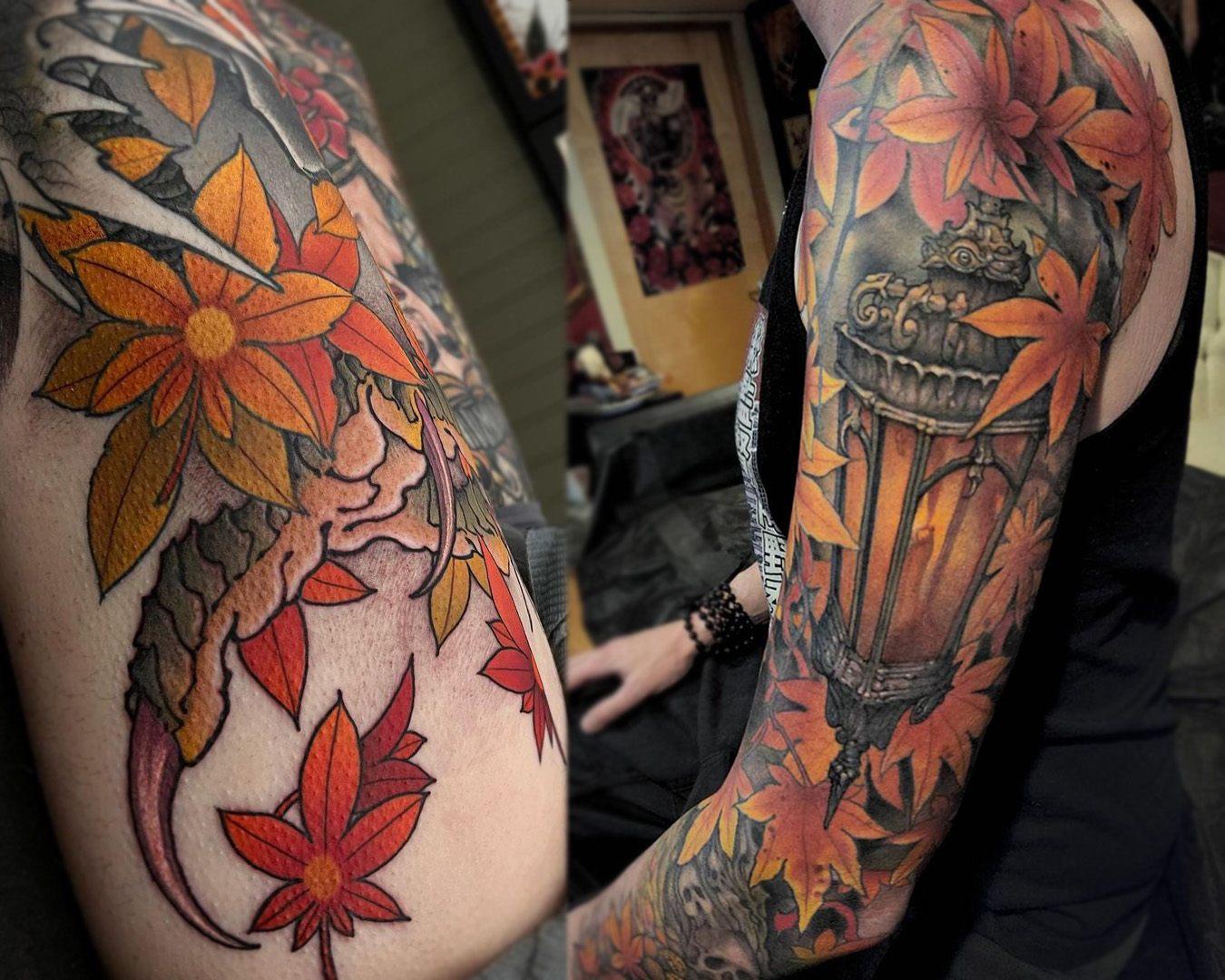
Drawing For Tattoo Design: Tattooing Through a Painters Eye Chris Dingwell EP 271
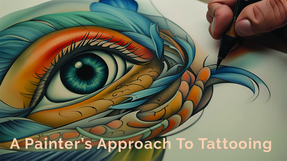
Tattooing Through a Painter's Eye | Chris Dingwell | EP 271
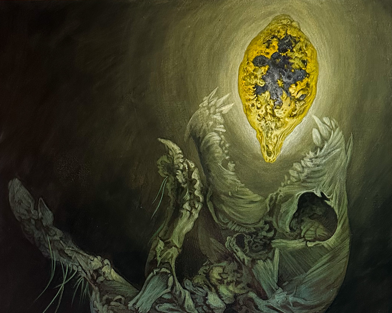
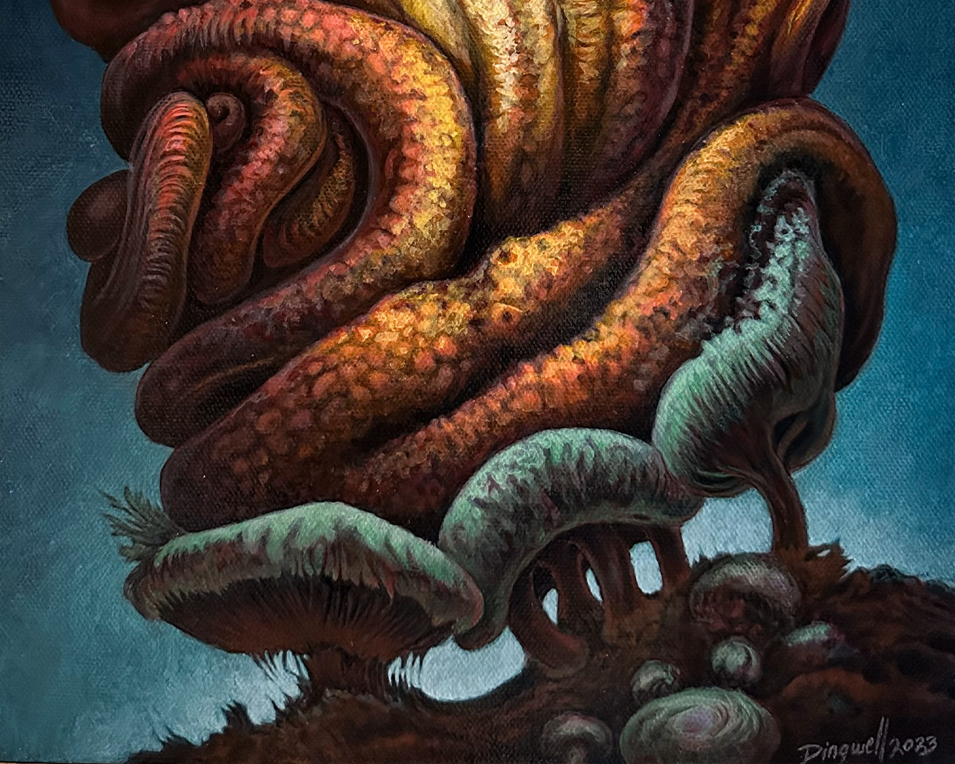
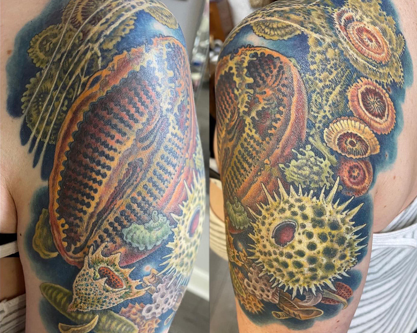
Chris Dingwell has been tattooing a long time. Chris Dingwell has been painting a long time.
In today's episode, we sit down with Chris to discuss his approach to tattooing and how painting and other fine art mediums have molded him into the tattooer he is today.
Enjoy!
This episode was made possible thanks to:
Interview by By Jake Meeks —
Writing By Daniel Pushcarich —
Topics: Painting, Tattooing, Traditional Tattooing, oil painting, cover-up tattoos, american traditional, illustrative tattoos
“It was incredibly inspiring for me to see, even six or ten other artists around the country say fuck you to that whole traditional thing, I’m gonna do what I want.”
— Chris Dingwell
Chris Dingwell (@chrisdingwell) is a multi-dimensional artist with a Master’s degree in Ceramics and Sculpture, along with a background in printmaking and multi-media work. He is an accomplished painter as well, and has been tattooing professionally full time for 29 years.
Chris Dingwell is based in Portland, ME and owns/tattoos at Squirrel Cage Studios.
Please enjoy!
INTERVIEW LINKS, MENTIONS, AND SHOW NOTES BELOW…
SELECTED LINKS FROM THE EPISODE
- Connect with Chris Dingwell:
SHOW NOTES
- [01:26] Enter Chris Dingwell, Always An Artist Not Yet a Tattooer
- [08:26] Collecting A Backpiece
- [11:56] Walking Up To The Don
- [15:54] Tattooing, What Other Choice is There?
- [20:57] Bold Will Hold? Well...It Depends
- [31:05] Tattoo Ink Has Come A Long Way, Fugitive Pigments Be Damned!
- [36:45] Traditional Tattooing Was More Of A Business Decision Than An Artstyle
- [41:37] Faking it for 30 Years
- [45:36] Painting Techniques Applied to Tattooing
- [54:03] It's a Frickin Laser! Secret Techniques and the Art Of The Cover-Up
- [01:00:15] The Devil IS The Details
- [01:04:36] The Most Important Part Of A Design is Value Contrast. Period.
- [01:09:57] Honestly, It Doesn't Matter What Color It Is…
- [01:18:29] There's No Right Way To Tattoo, And My Way Definitely Isn't It!
- [01:20:15] Outro
MORE CHRIS DINGWELL QUOTES FROM THIS INTERVIEW
Traditional Tattooing Was More Of A Business Decision Than An Artstyle
[36:45] “You have to be able to take this idea, simplify it down to its most basic elements, but every one of those elements has to be just perfect.”
— Chris Dingwell
Traditional styles of tattooing are very deceiving. Though these designs tend to be on the simpler side, they are far from simple to design or execute. It’s about boiling an image down to its most basic ideas and elements and making it extremely readable or clear from any distance. And, to track that even further you have to be extremely precise with those elements because the tiniest mistake can end up being pretty glaring.
Traditional Americana tattoos are particularly special because they were purposefully created and simplified so that tattooers could move fast. Sailors or military personnel weren’t around for weeks or days at a time so that an artist had time to finish a large scale piece. They had to work quickly and with precision so they could get clients in and out before they had to leave port. It’s not like it is today where most artists tattoo clients for months or even years at a stretch.
Painting Techniques Applied to Tattooing
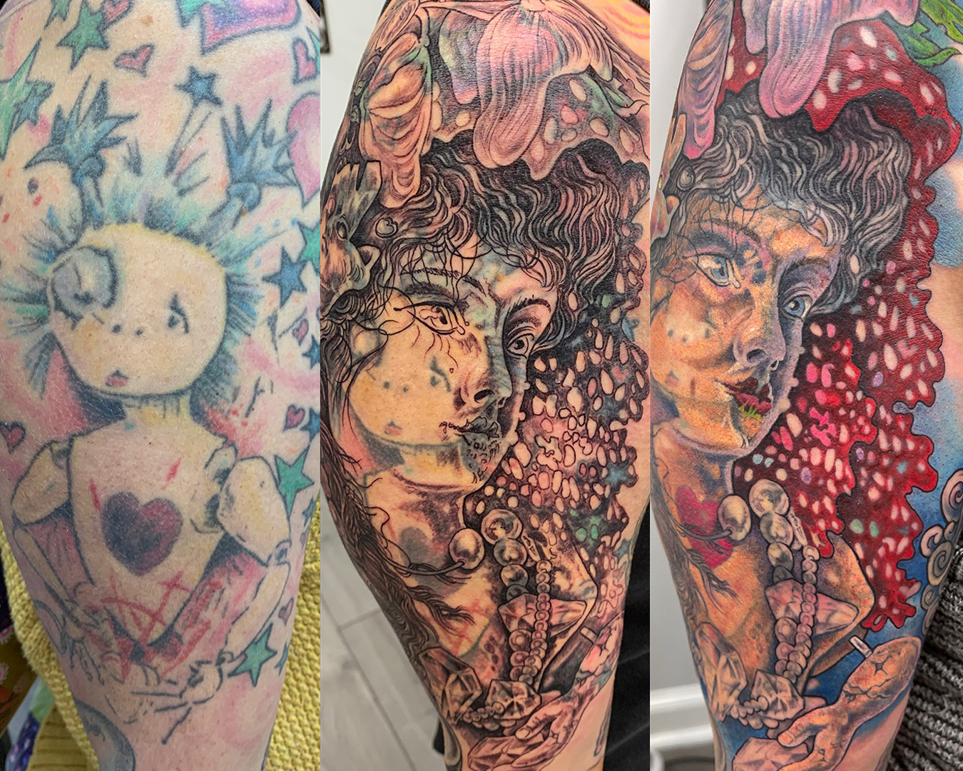
[45:36] “Even the term ‘cover-up’ is misleading because you can’t just cover up that old tattoo. What you’re actually creating is a blend of the old pigment with the new pigment”
— Chris Dingwell
The term "cover-up" is actually a bit paradoxical. When you're applying new pigment to skin that's already been tattooed, you're not exactly concealing the old design. This is because most tattoo ink is transparent, leading to a mingling of old and new pigments in the same skin layer.
Imagine it like gently layering acrylic and oil paints on a canvas. When you're working on a painted canvas or need to fix a mistake, do you just pile on new paint to hide the problem? Maybe, but a smarter move is to subtly adjust the colors and shapes in a different direction. Adding thin layers of paint can tweak color tones or adjust shapes to make the area more manageable.
Another way to truly cover up an old tattoo is by first removing it with laser treatment. Laser action weakens and removes some of the old tattoo's pigment, making the covering-up process easier. This reduces the need for excessive blending with the old tattoo to achieve the desired colors, allowing the new ink to fully saturate the skin. Still, it's wise to chat with laser technicians to grasp how the laser interacts with the skin.
Secrets of Cover-up Artists, Neutralizing Colors in Tattoos With Their Complementary
[54:03] “Blue and orange are complementary colors. That means that if you mix them together they cancel each other out into a neutral gray. Most tattooers don’t really learn about that sort of stuff.”
— Chris Dingwell
Let's continue on the theme of cover-ups and color theory. Dealing with old tattoos sporting vibrant colors can be a challenge. One effective approach in such cases is to counterbalance or soften the intense color with a complementary color.
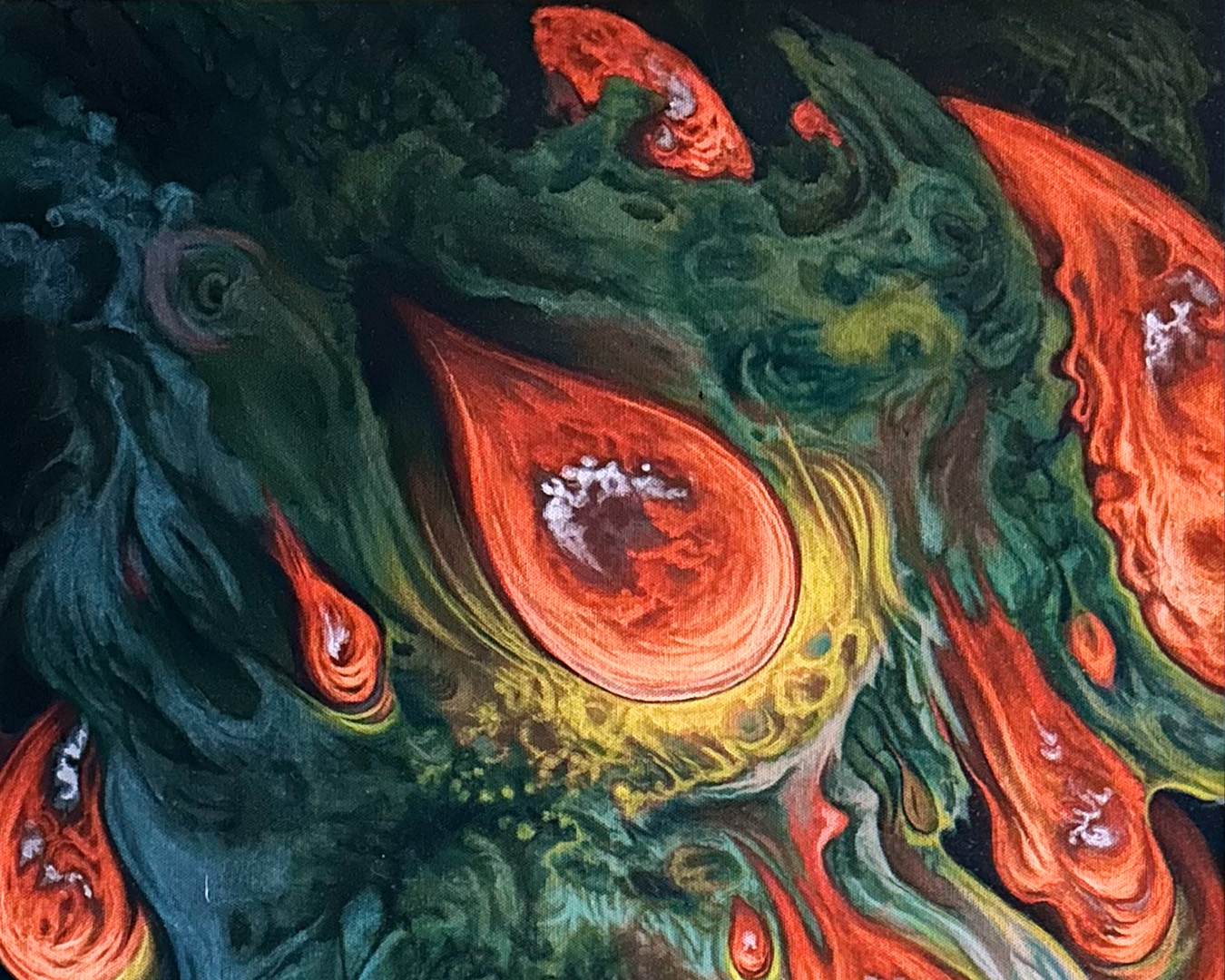
Complementary colors are pairs of colors that sit directly opposite each other on the color wheel. They create a striking contrast when placed side by side and can be harnessed to balance or intensify the visual effect of each color, making them a valuable tool in various applications. Another useful purpose to complementary colors is blending them straight into the original color to neutralize or sometimes just slightly desaturate a color.
For example, if you encounter a very bold, warm red in an old tattoo and the client seeks a more subdued look, introducing cool greens can help neutralize the area, giving it a grayish undertone. This facilitates a smoother shift from that grayish base to other colors like purple, blue, or yellow. However, bear in mind that when employing this technique, those additional colors may also display a slightly subdued quality, contingent on the specific context.
Honestly, It Doesn't Matter What Color It Is
[1:09:57] “A traditional oil painter in the renaissance technique would create the entire layout as a black and gray painting, almost the same way that we would create a black and gray tattoo now.”
— Chris Dingwell
When you're working across various tattoo styles, one key technique for ensuring your artwork stands the test of time is to establish a solid foundation of black and gray first. This monochromatic structure can be seen as a sort of underpainting, reducing the need to worry over color choices.
Since most tattoo pigments are transparent, the black ink does a lot of the work for the tattooer in creating value contrasts within the design. Value contrast is one of the main factors in creating a visually impactful piece or design. These would be your light and dark areas, shadows, and light source, and they contribute to defining the shapes of objects or elements in the tattoo and also guide the viewer's gaze through the piece. In instances where you have improper or poorly defined contrast, particularly in illustrative or visually narrative tattoos, the colors or shapes might appear flattened or certain areas might disrupt the natural flow of the eye.
Conversely, if your design showcases strong value contrasts, the color selection becomes secondary. The solid interplay of lights and darks can lend a captivating visual impact that often supersedes any of the colors you chose to use. This understanding underscores the pivotal role of black and gray shading in both elevating the aesthetic quality and ensuring the enduring allure of the clients tattoo.
PEOPLE MENTIONED
- Brad Fink
- Leo Zulueta
- Vyvyn Lazonga
- Ed Hardy
- Guy Aitchison
- Sonny Tufts
- Stan Moscowitz
- Marty Holcomb
- Marcus Pacheco
- Paul Booth
- George Burchett
- Nick Baxter
- Cory Krueger
- Keith Ciaramello
- Nikko Hurtado
Want more tattoo education and resources?
Check out our Drawing For Tattoos catalog HERE!
Transcript for this video can be found (here). All transcripts can be found (Here)
(Update when transcript page is made)
The Fireside Tattoo Network is home to the Fireside podcast, Fireside Technique video series and our Fireside Weekly blog.
The Fireside Tattoo podcast is hosted by veteran tattooer Jake Meeks, check out our episodes where we discuss, argue and wax philosophical, from tips for all levels of artists to trends in the tattoo world. Many guest artists have sat down for interviews and in-depth conversations and many more are planned…check back often!
Our Fireside Tattoo Overview video series offers informative, short, and detailed videos geared towards helping artists understand the science and nuances of tattoos and make more informed decisions to improve their work. We often take some of our more technical topics from our Fireside podcast and film an in-depth, narrated, time-lapse video showing exactly how Jake or our featured artists handle certain issues.
Support us while buying the stuff you need at the links below!
- Get 10% off the Neuma 4 with code “Fireside” at checkout
https://neumatattoo.com - Get 10 % off all S8 Tattoo products with promo code “Fireside”
https://s8tattoo.com/ - TattooNOW Website and Automation services at the link below
https://TattooNOW.com/Fireside - Get 10% off your order from Raw Pigments with code “fireside”
https://rawpigments.co/
Drawing for Tattoo Design
Your tattoo designs starting to feel stagnant? Feel like you’re not progressing? Drawing is the single most important piece of the tattoo process. No level of technical tattoo skill can overcome bad composition and draftsmanship.
Fireside Tattoo Network simplifies the tattoo design process with the Fireside Method. By focusing on the principles of Shape, Value, Edge and Color, we help you identify and solve your biggest challenges early in the design process.
The Fireside Method:
Check out some of our podcast episodes as well!
Recent News
Tattooing Hands and Knuckles
- 04/10/24